Group Series By
Group By is a powerful Chart attribute, which splits the matching chart data into multiple data series, based on the Group By attribute selected.
The same chart configuration can change the Group By to render multiple different
views of the same chart data:
- Regression Name
- Component
- Branch
- Build
- Test Group
- Job Category
Example Group By Charts
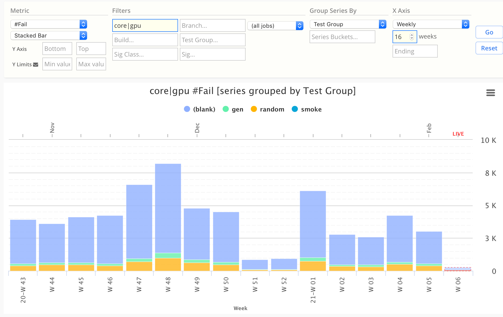
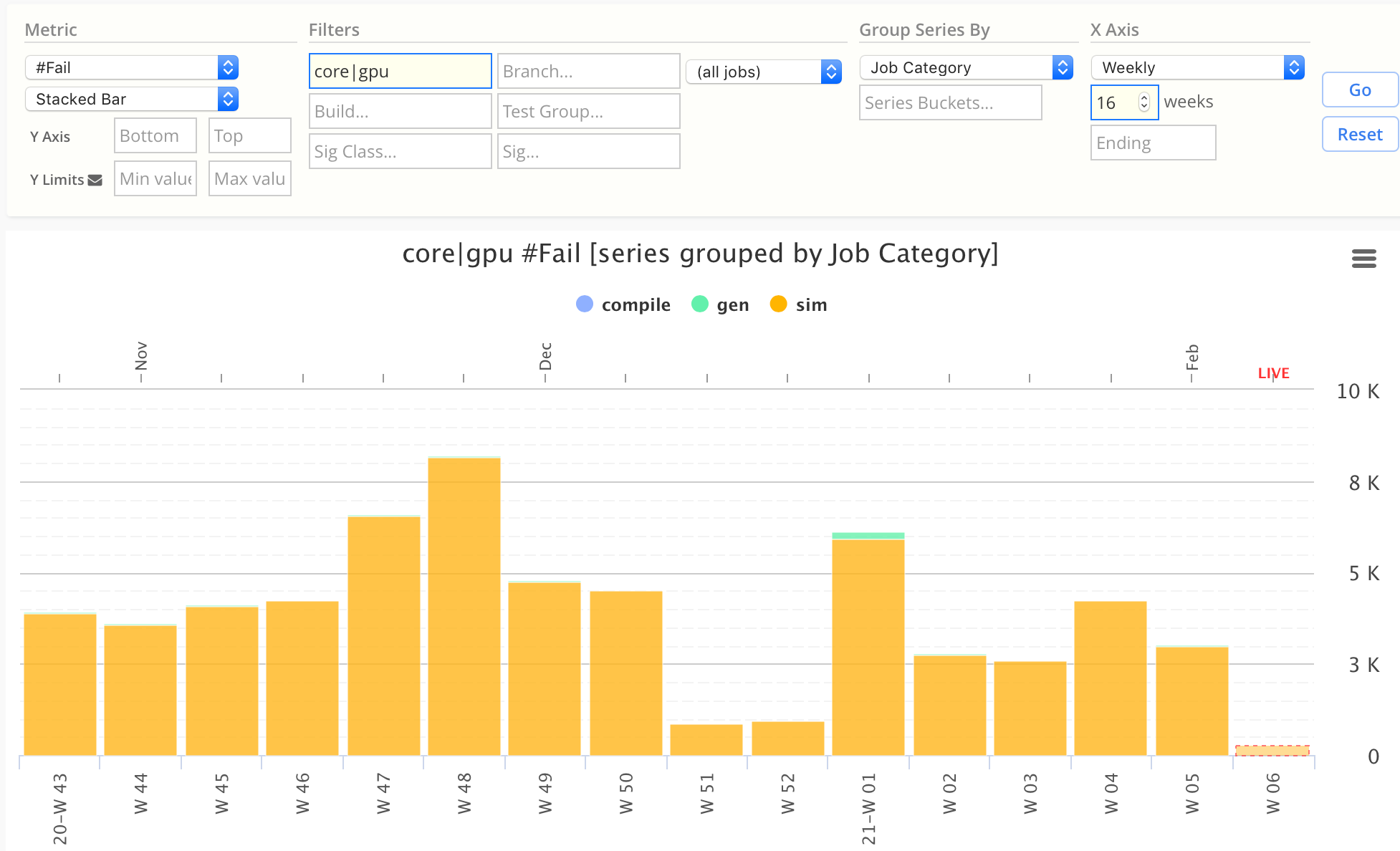
In the following examples, a Fail stacked bar chart can be grouped by multiple group-by attributes.
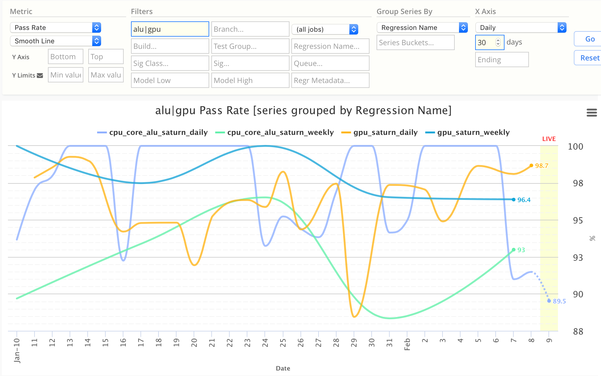
Regression Name
→ See the pass rates of each regression series (ie daily vs weekly).
- Note this chart uses
Pass Ratemetric instead of#Fail
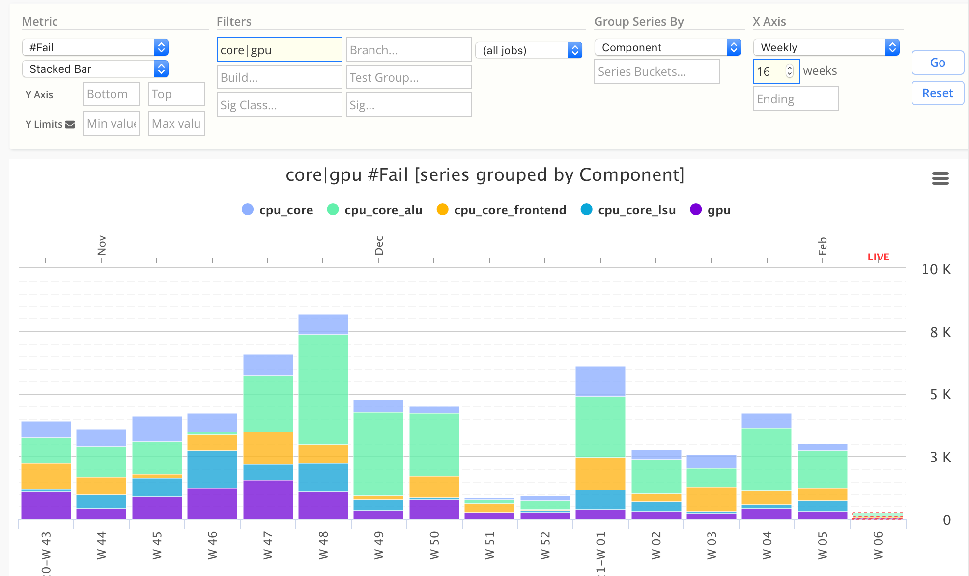
Component
→ See the number of fails of each Component.
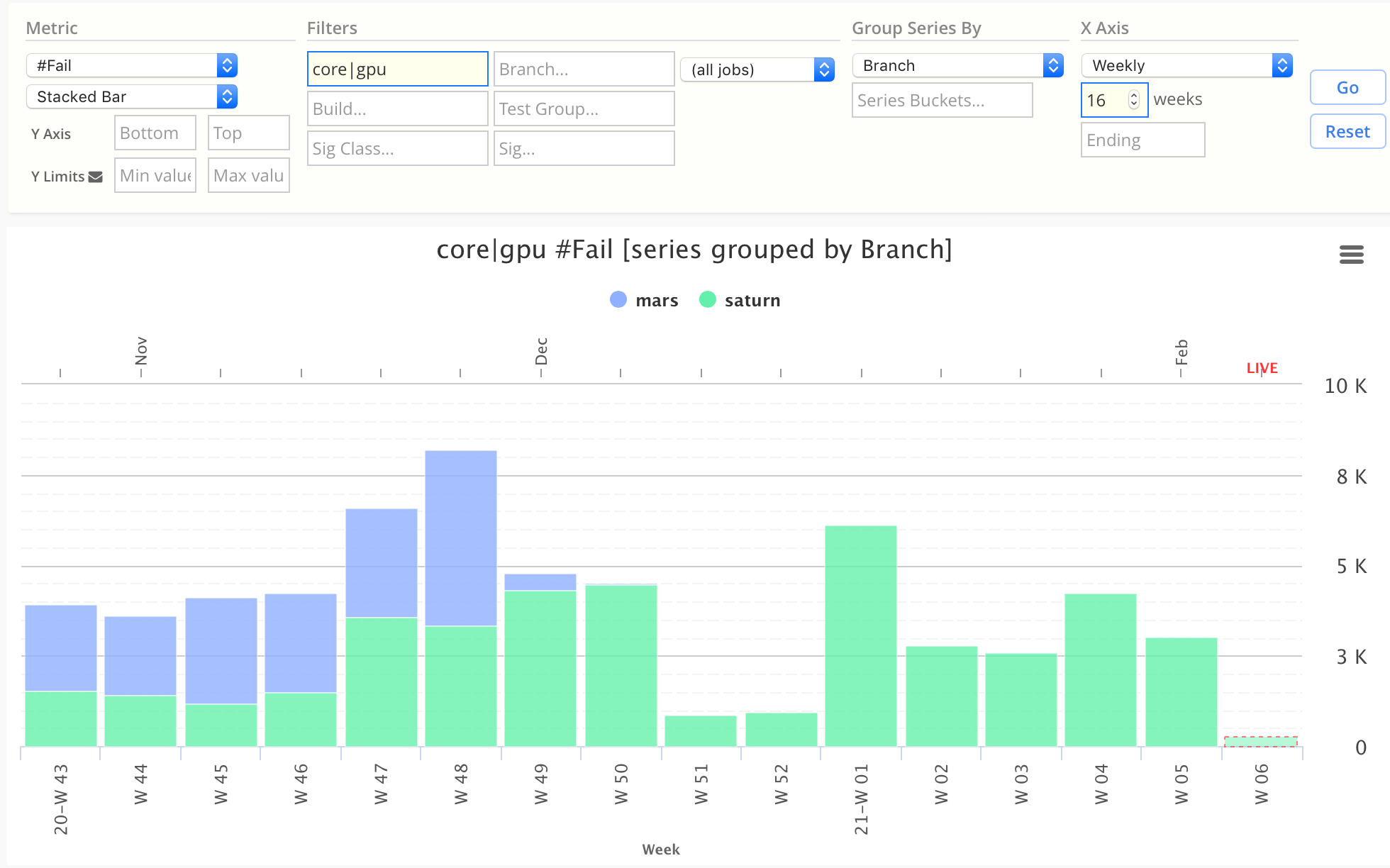
Branch
→ See the number of fails of each Branch.
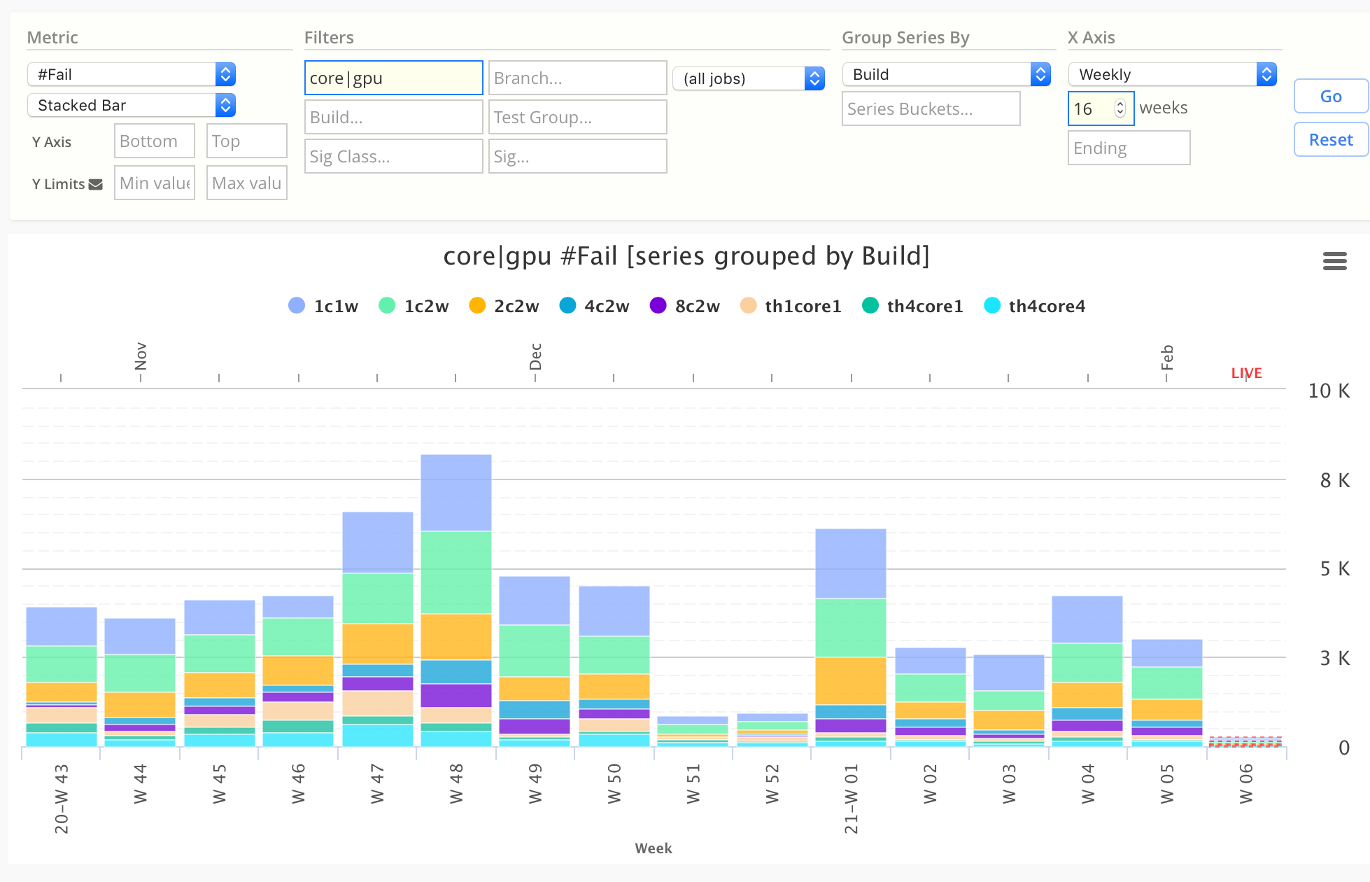
Build
→ See the pass rates of each Build.
Test Group
→ See the pass rates of each Test Group.
Category
→ See the pass rates by each Category (ie simulate, generate, compile).
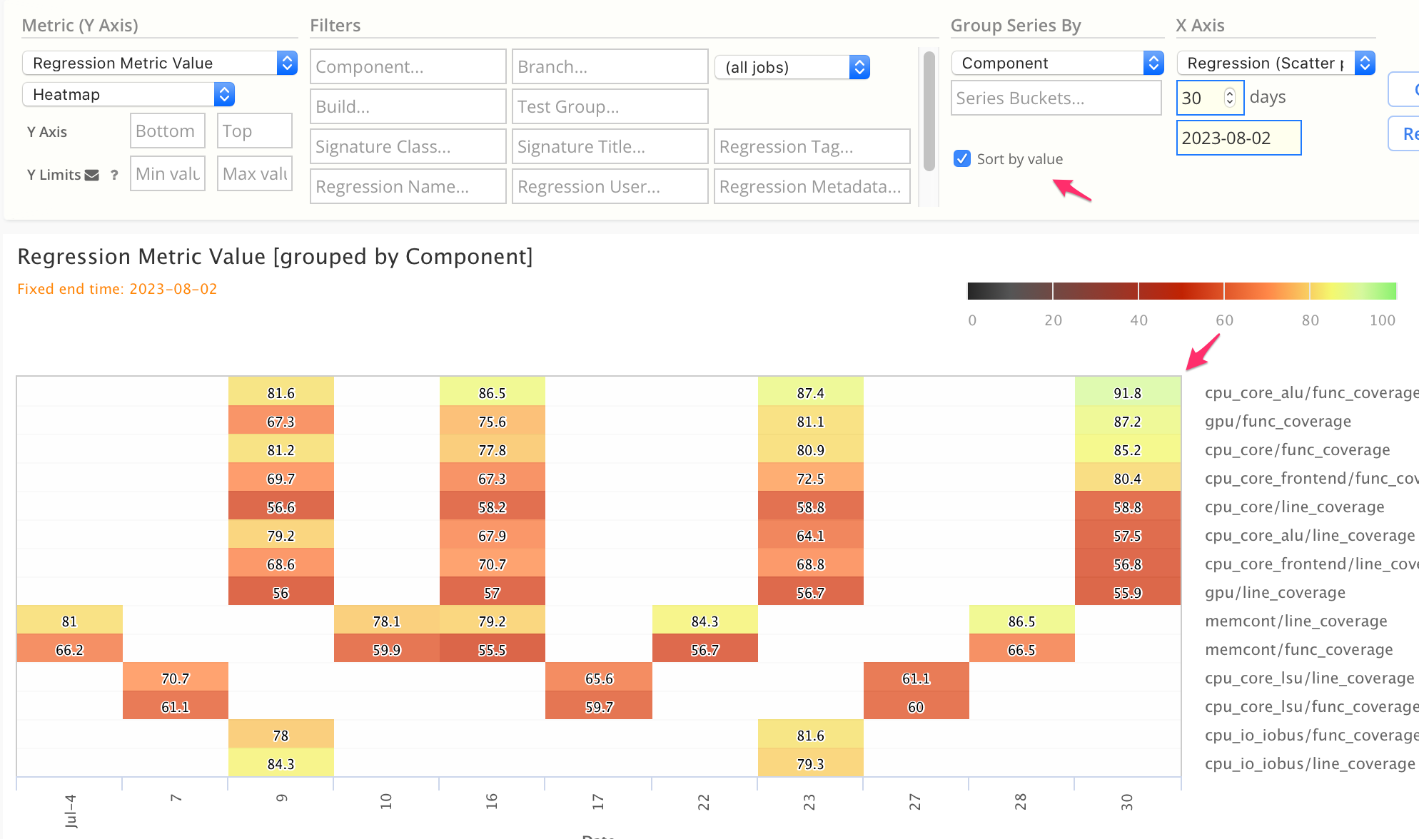
Series Sorting by Value
By default, chart series are sorted alphabetically.
To sort the series list by latest data value instead, click the Sort by value checkbox.
- This is useful for Stacked Bar charts, Stacked Area charts, and Heatmap charts.
- In stacked charts, the largest series are stacked from bottom-up.
- In heatmap and data table charts, the series are ordered from top-down.
This example shows a Custom Metric Heatmap, with series sorted by data value (highest to lowest):
Advanced Grouping: Series Buckets
→ See Custom Series Buckets.