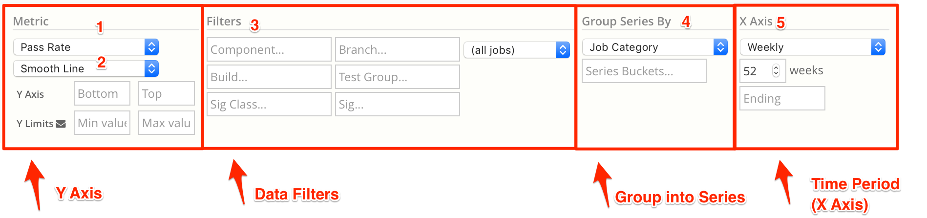
Chart Time Period (X-Axis)
Simscope has a few options for X-Axis Time Period precision.
Time Precision ranges from Weekly (lowest precision) → Regression (highest precision)
Weekly Time Period
Weekly charts are useful for showing long-term data (across up to a year of data). Weekly charts smooth out the day-to-day noise, to show more consistent charts.
Each X-axis point represents a single week's worth of data.

This uses the ISOWeek format, with a 2-digit year and a 2-digit week:
yy-W wwyy= YEAR (2-digit)ww= WEEK (2-digit)
Example week:
21-W04- The fourth week of 2021
Jan 25, 2021→Jan 31, 2021
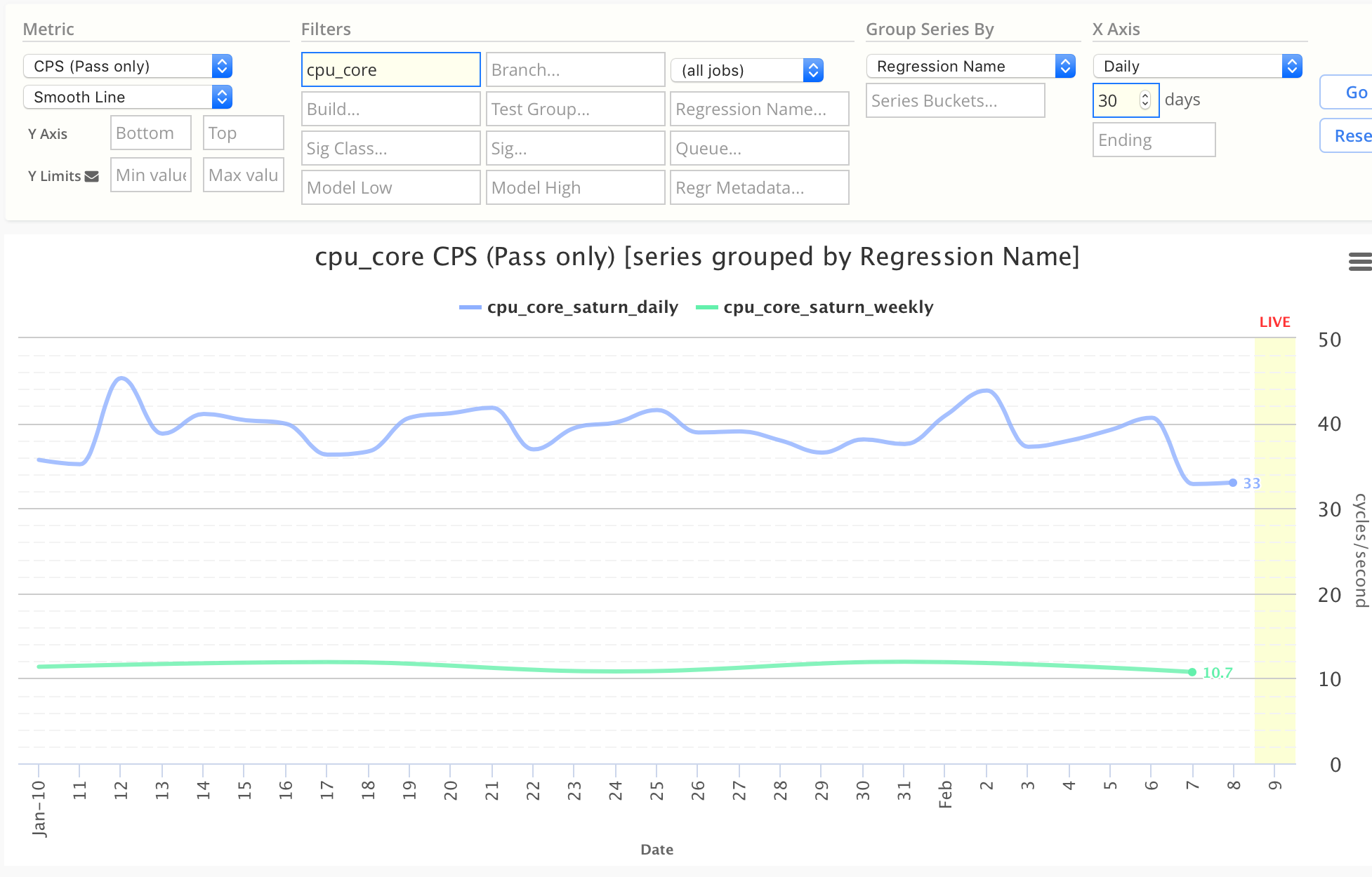
Daily Time Period
Daily charts render each day as different point on the X axis. These charts are useful for short-term, more detailed charts.
The date range can be changed for shorter or longer charts (ie 7-day, 30-day, 60-day).
Regression (Scatter Plot)
Regression precision charts are similar to Daily except it plots each individual data point on a line, using a scatter-plot.
- Note the chart below has many individual blue and green intra-day dots.
For example, if you have 10 regressions on a single day, this will show 10 data points on a line.
- Whereas a Daily chart would average (or sum) the 10 regressions into one data point.
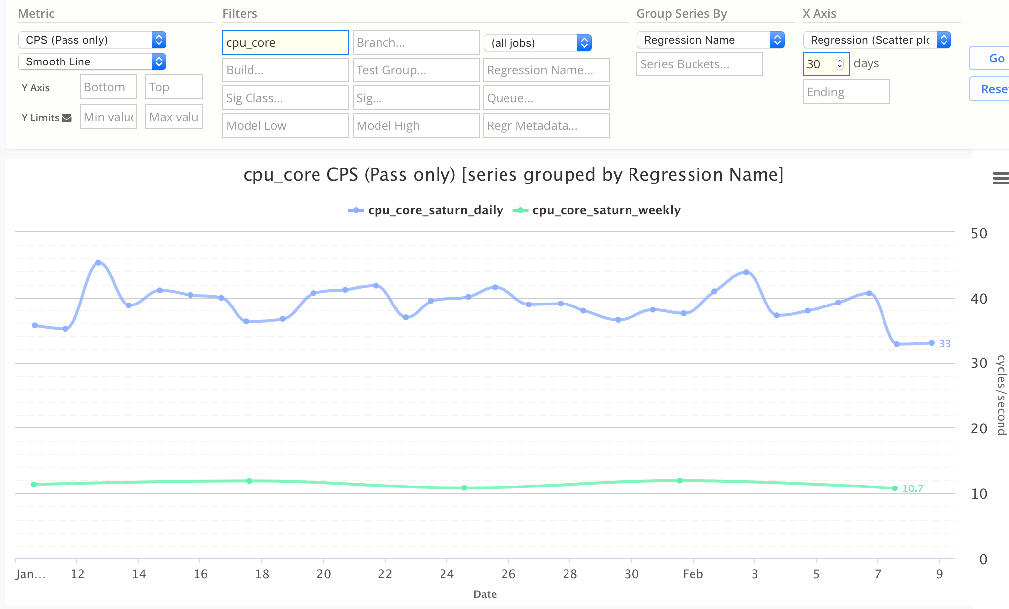
Note: Regression-period charts should almost always be used with Line charts