Regression Gantt Chart
The Regression Gantt Chart is a Gantt chart showing each job launch within a Regression, which allows either viewing or optimization regression performance.
- This enables debugging of lagging jobs (bottlenecks), which are stalling completion of a regression.
- This view can be used to remove or shorten long-running jobs, or to reschedule long jobs to run as early as possible.
See also Histogram.
Gantt Chart Example
This example shows a Gantt chart for a 600-job regression:
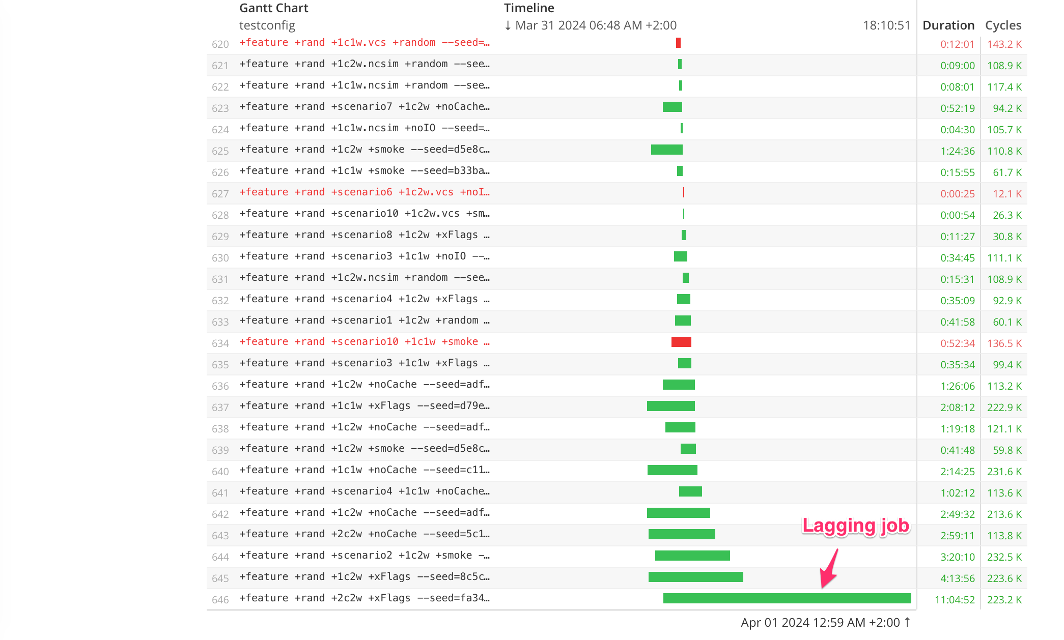
- If the Lagging Job can be removed, shortened, or re-ordered, the regression duration would shrink.
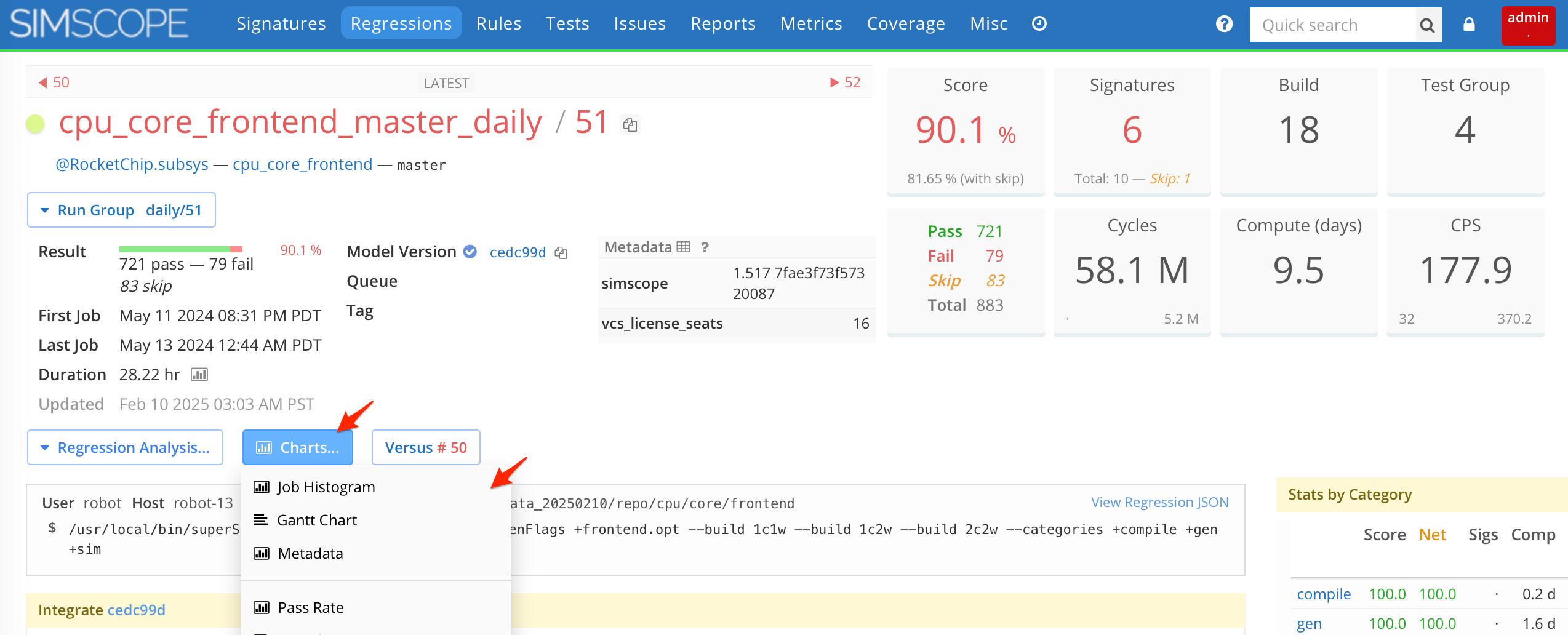
Accessing the Gantt Chart
To access the Gantt Chart:
- Go to any Regression Details page.
- Hover over the Charts button.
- Click the Gantt link.
See the screenshot below:
Filtering Jobs
By default, this shows all jobs in the Gantt chart. You can filter by any test field, to make charts of sections of a regression. For example, pass or fail jobs only, or a specific build, or test group.
Gantt Sorting
By default, the rows are sorted by End Timestamp ascending. This means the bottom-most row is the lagging job.
Alternatively, you can sort by:
- Start Timestamp
- Title
- Total/Average Duration
- Score
- Number of Jobs
Gantt Grouping
By default, Gantt shows one bar per job. You can alternatively group jobs together into group-based gantt bars, to enable viewing simultaneous data. Choices:
- Test Config
- Test Name
- Build
- Test Group
For example, this Gantt chart is Grouped by Build.
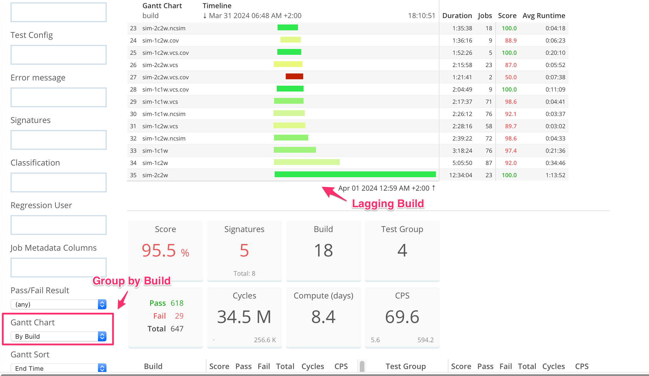
- Note the colors of the gantt rows indicate the Score (ie combined Pass Rate) of the group.
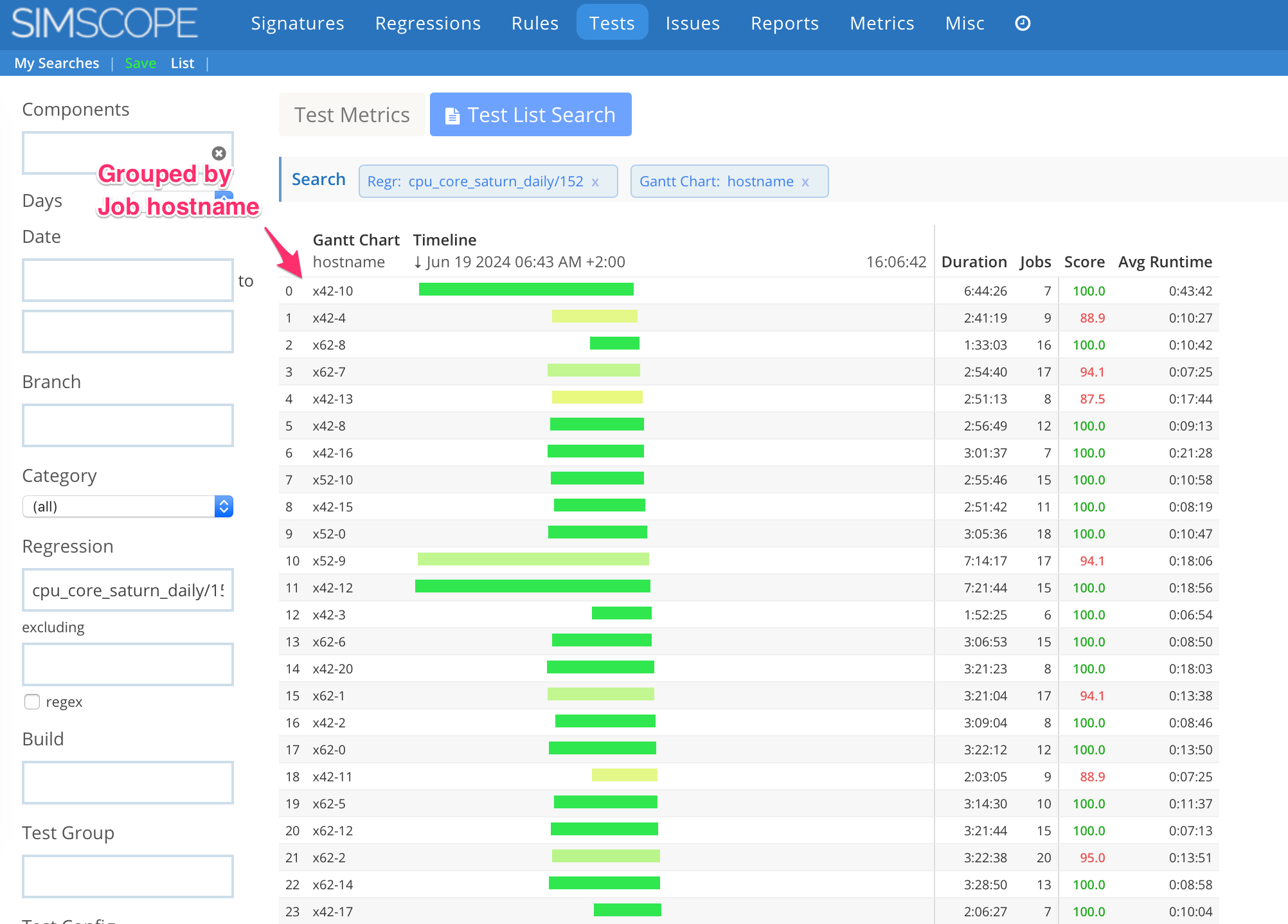
Gantt by Job Hostname
Gantt charts can be grouped by Job Hostname.
- This chart can be used to isolate poor performing compute hosts.