Metric Charts
Simscope tracks data metrics across jobs, which can be used to render charts.
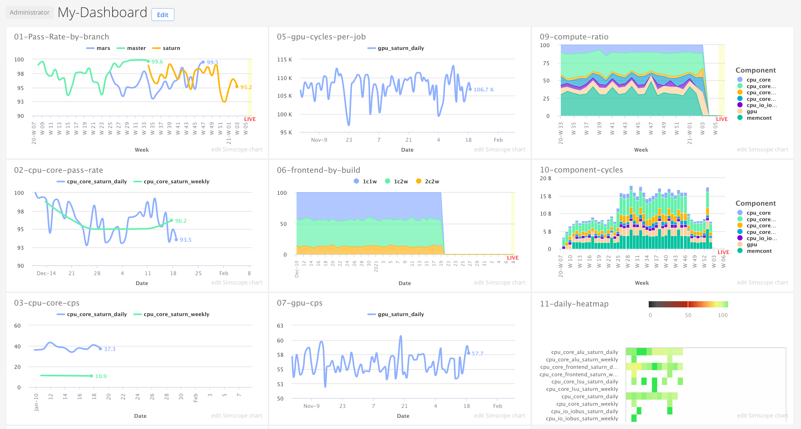
Charts can be saved, and then combined to make Dashboards.
Intro
New users should start by looking at a variety of example charts:
→ See Charts by Example.
How to create a chart?
Here is an overview of the chart configuration boxes:
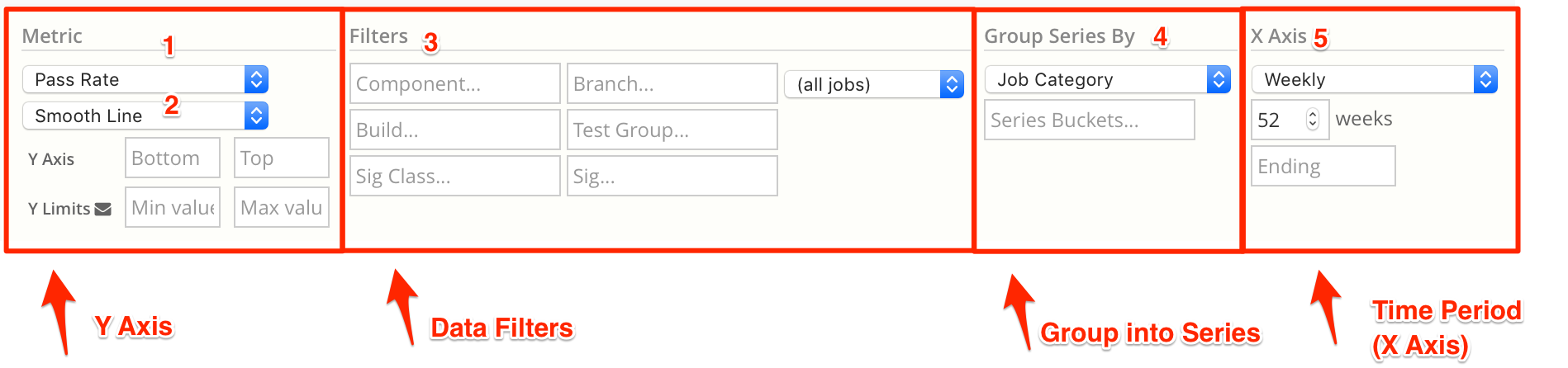
- Select a Metric value to chart.
- Select a Chart Type.
→ The default is a line chart. - Set Data Filters to match data.
By default, all jobs will be used. Usually, a chart should be filtered by component, regression name, branch, test group, etc. - Select a Group By to split the data into multiple time series.
- Select a Time period for the chart.
→ By default, charts are weekly.
Chart Email notifications
See Chart Email Notifications.